Since 2024, leading the concept development and proof-of-concept execution for emerging new form factors anticipated to define the next era of consumer hardware.
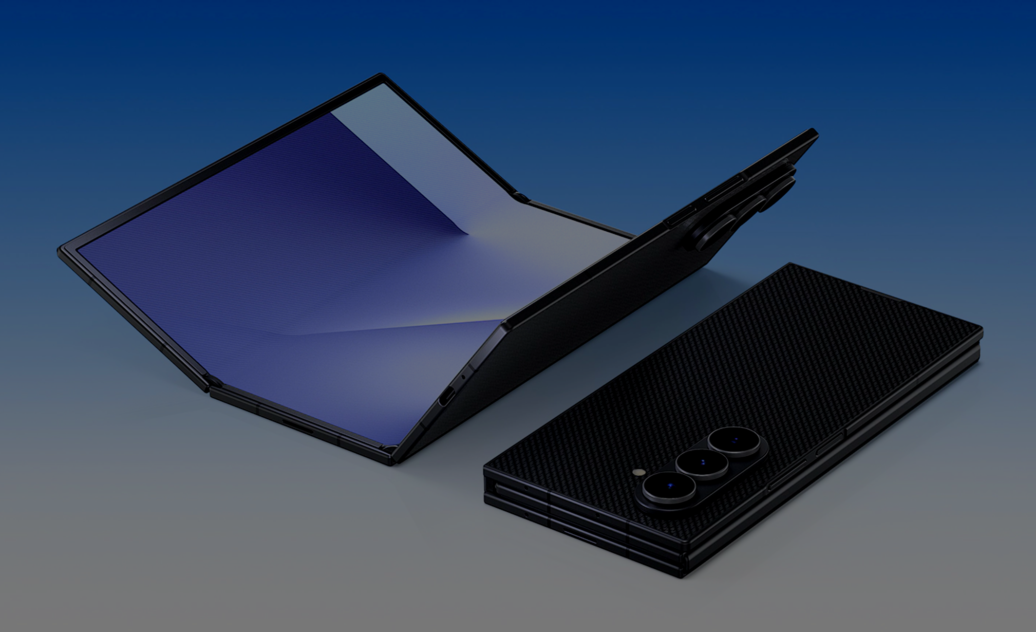
A section that shows the thinking process rather than technical specs.
"What is this product's primary state - a phone, or a tablet?"
Phone-First
You carry it as a phone, and unfold it into a tablet when needed.
Primary use = communication, quick access
Portability is default
UX priority: cover screen quality, unfold trigger
Tablet-First
You buy it as a tablet, use it as one, and fold it for portability.
Primary use = productivity, content consumption
Screen real estate is default
UX priority: full-screen layout, fold-to-carry
UX Frame
Not simply "folded / unfolded" — but defining the usability of each distinct state.
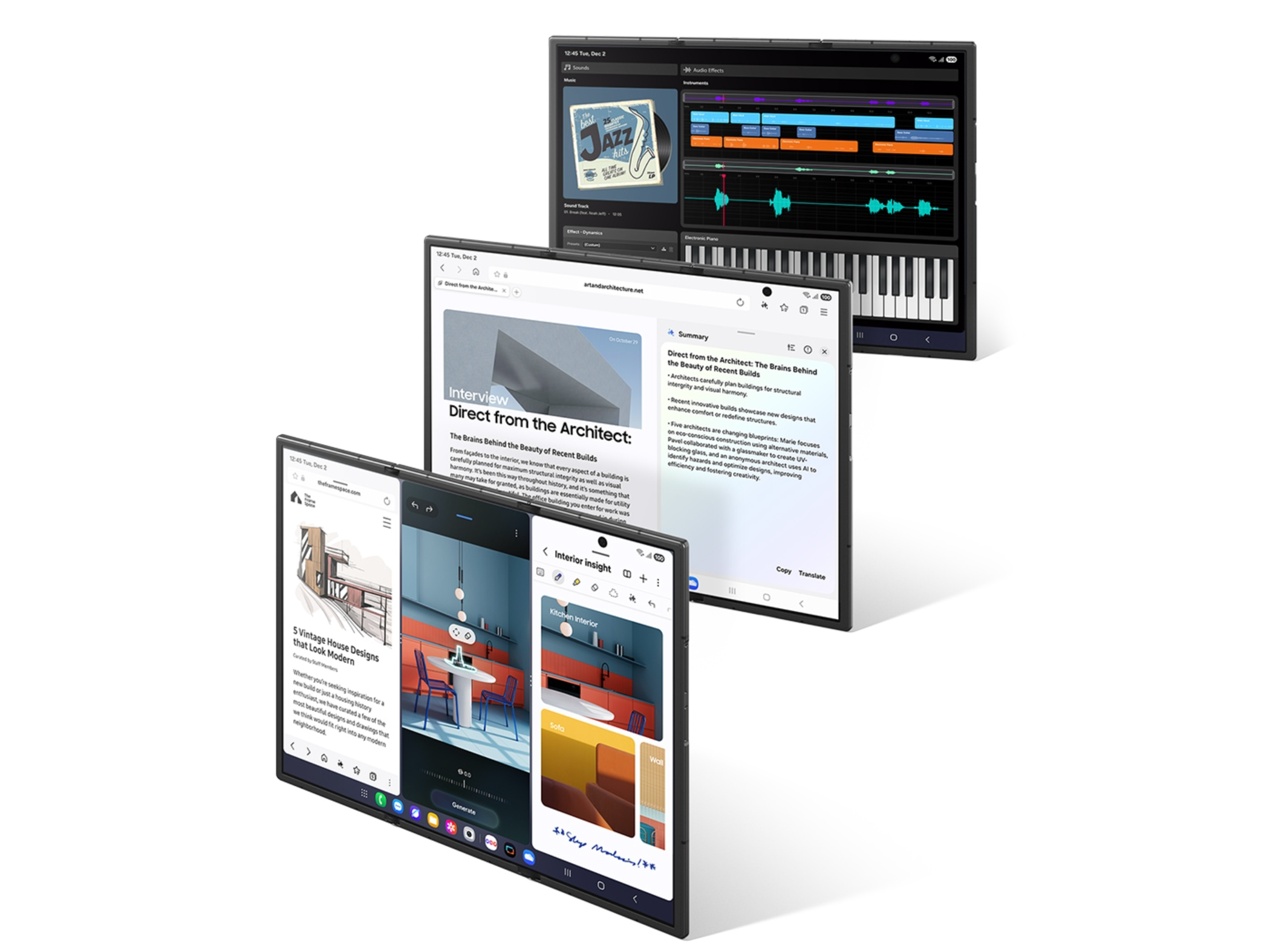
Folded (6.5"). Phone mode
Quick communication, on the go
Half-open. Flex mode
Angled use, video calls, side-by-side content comparison and editing
Fully open (10"). Tablet mode
3-app multitasking, DeX, immersive work — maximizing multitasking
Key UX Challenges & Decisions
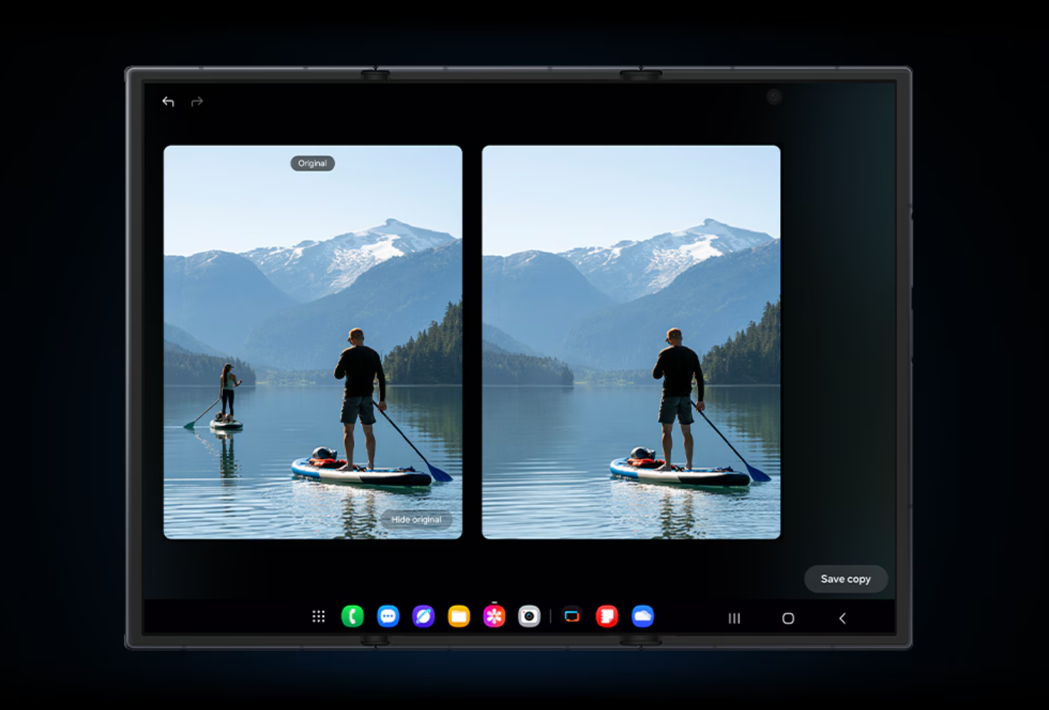
Cover Screen Completeness
If this is Phone-First, the cover screen cannot be an afterthought. It must be designed as a fully independent phone experience.
The Unit of Multitasking
Should the 10-inch display be treated as one large canvas, or as three 6.5-inch phone-sized panels?
→ Direction: "3 portrait apps side by side" — since each panel is phone-sized, app compatibility issues are minimized.
The Weight-Portability Tradeoff
309g — light for a tablet, but heavy for a phone. The question is how this tension is resolved through narrative.